
Color Bind

(Note: Some of the bloggers whose posts I regularly read are reporting instances of impersonators sending unsolicited emails to their subscribers. Although I haven’t experienced that kind of intrusion or abuse (and probably won’t, with my readership in low numbers), I can say I have recently received some very odd emails through my Substack blog. Critically, I want you to know I will never, ever ask you for money. I have intentionally set up this blog so that it is free. There is actually no way for you to pay for it. Substack doesn’t even have my bank routing information. If anyone purporting to be me ever contacts you asking for money — even subscription money — please know it is a scam and report it to me.)
“Colour expresses something in itself.” — Vincent van Gogh

My husband and I just celebrated 38 years of marriage. How can that even be possible, we ask. We are pretty sure the calendar doesn’t lie, though. We’ve been through a lot together and survived.
But now a new challenge awaits: It’s time to repaint our house.
Choosing colors is sort of like pre-arranged marital discord in this family. My spouse and I have widely differing (and strongly held) opinions about house colors. I like bright, vibrant colors. The older I get and the bigger my cataracts become, the brighter I like my colors. For me, bright colors express exuberance, a feeling I yearn for but don’t always experience.
My husband’s favored house colors have tended to be more conventional. He has not been opposed to bright colors as long as they are, say, colonial yellow or barn red. As for interior colors, when we were first married, he would agree to any wall color as long as it was white. And not fancifully named white either — no “snowflake white” or “cirrus white” or “glacier white” for him. No off-white of any description either (a rare instance of agreement between him and me). Just white.
Have I mentioned that I really love colors?
Maybe you have a sense of the challenge ahead of us.
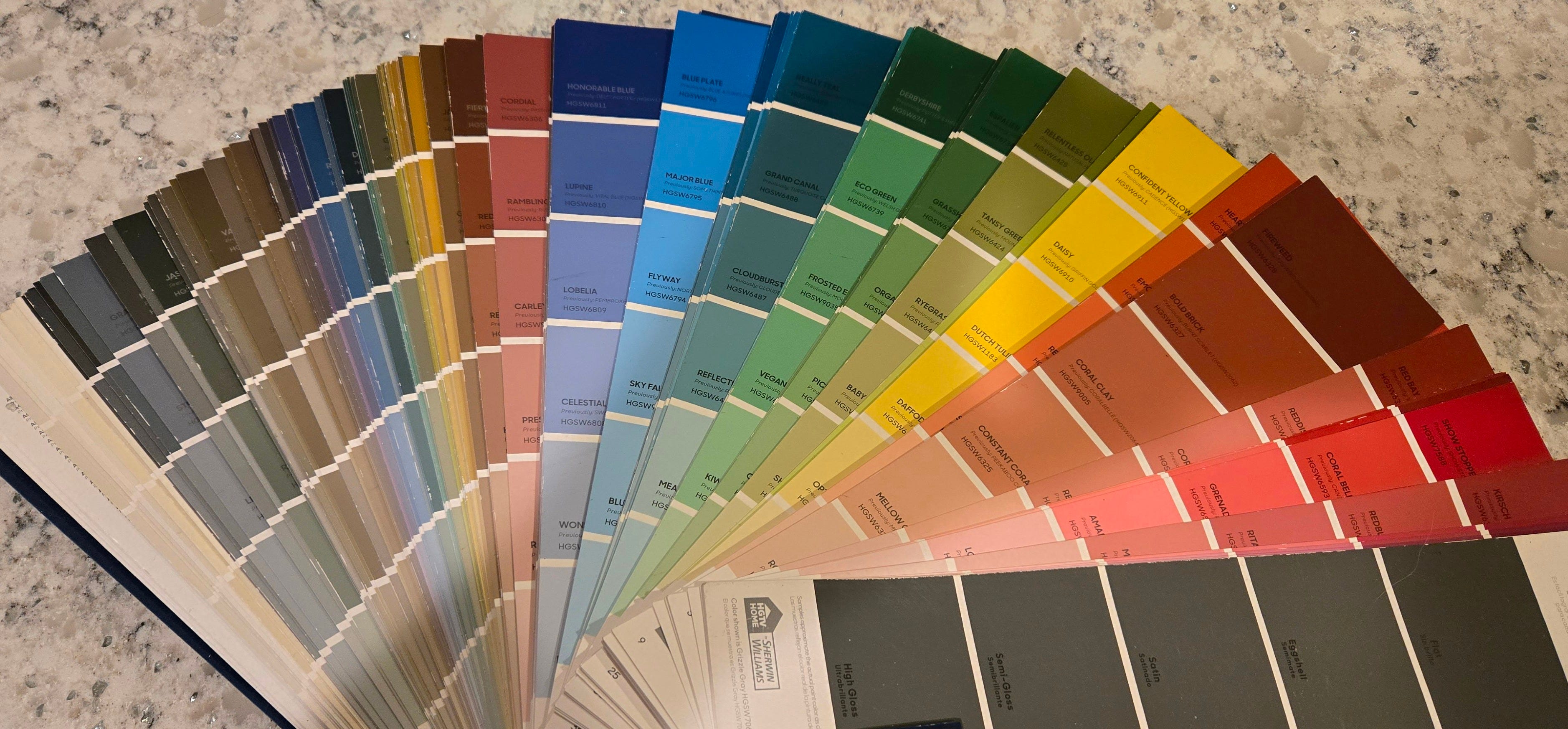
When we moved to our current house, we miraculously agreed its color (putty) was boring. So, when it came time to paint, we set out to find a color combination more interesting and pleasing to the eye. We uploaded a photograph of our house onto the Sherwin Williams website. That should make it easy, we thought, as we set about pasting colors onto the photo of our house to see how they would look.
It wasn’t easy at all! My husband would choose color combinations he loved. I would veto them. Then I would choose color combinations I loved. He would veto them. After many attempts to reach consensus, using the tool on the Sherwin Williams website ceased to be fun and started to become annoying.
After struggling along for quite a while we had the bright idea of considering color combinations Sherwin Williams recommended as compatible, even lovely. There, at last, we found three colors we liked. Voila — our compromise! After the house was painted, we stepped back and oohed and aahed . . .
. . . and discovered we don’t even see colors the same way. Hoo boy. When I started sending out directions to our house, I told people ours was the green house on the corner.
“Our house isn’t green. It’s blue,” pronounced my husband.
I went outside to look. There was no way our house was blue. It was clearly green.
Then our son got involved. “No, it’s blue,” he said.
I started asking people what color they thought our house was. I hang my head low as I report to you that most people seem (erroneously) to think our house is blue. (How can So Many People be wrong, I ask you!)
This whole business of choosing colors — and even seeing colors — got me to thinking about how people experience the world. We see and hear and feel what we see and hear and feel — but our experiences are entirely subjective. Obviously, disagreement abounds on all manner of topics.
Remember when a decade or so ago, an innocent email about a dress led to a furor over what color the dress actually was? This is the dress I mean:

The argument started when Cecelia Bleasdale texted the above photo to her daughter, saying she planned to wear that dress at her daughter’s upcoming wedding. But Bleasdale and her daughter saw way, way, WAY different colors in the picture. One of them saw a blue and black dress. The other saw a gold and white dress. So Bleasdale’s daughter posted the photo to her Facebook page and asked people to weigh in. The Internet exploded, with people sharing the photo on various social media sites and asking their friends to describe what they saw. Sides were drawn up: the blue and black side vs. the gold and white side. The millions and, literally, millions of people who viewed the picture were adamant about what they saw. ‘The dress’ went viral 10 years ago and taught us the science of color
What do you see?
I see a gold and white dress. Which is wrong. The dress was actually blue and black. My husband sees a maroon and blue dress, which wasn’t even one of the choices at the time. So you see what we are up against when it comes to choosing paint colors.
Regardless of the colors you see in the photo of the dress, it’s impossible to see them the other way. Believe me, I’ve tried. I simply cannot get my brain to see anything other than a gold and white dress. People who see a black and blue dress simply cannot get their brains to see it any other way. And my husband is sticking with his maroon and blue combo.
We see what we see. Period. And then we stare at each other in astonishment and disbelief. How can we have such widely and wildly different interpretations of our world? Especially when objective reality ought to lead us all to the same conclusions?
These days we humans not only have to contend with our differing interpretations of objective reality, we also have to account for people who intentionally twist the facts — or introduce “alternative facts,” which are the same thing as lies — into the mix. No wonder our world is such a mess.
I can’t tell you how to fix our world, but I can say what has helped our marriage.
First, we both have robust senses of humor. Over the years we have come to laugh at our differing opinions — even interpretations — of color. Because, honestly, our predicament is pretty funny.

We’ve also learned to save our energy for the important stuff. Because it really doesn’t matter whether the house is blue or green or the dress is gold/white, blue/black, or maroon/blue. (Besides which, isn’t it fascinating that people can perceive those dress colors in such different ways? I mean, really, wow.)
We’ve also demonstrated to ourselves, over and over again, that the work of reaching compromise is important, possible, and even satisfying in the end. Patience is required. And, because we know this, we are beginning now to look at colors for a project we have planned for next calendar year. We have enjoyed our green/blue house color for many years now, and we have confidence we can find another color combo we will enjoy equally as well. Just . . . we need to engage the hard work of finding a compromise. And patience.
It bears mentioning that there’s always the possibility that one is wrong. Perhaps that is harder to argue where color is concerned, because color perception is such an individual thing. But viewpoints that have their basis in actual facts are one thing; viewpoints that have their basis in “alternative facts” or lies are another. Humility allows one to be open to correction if one is wrong. (Sometimes the actual facts just need to be presented in a different way. That dress? It all depends on what picture you are looking at. I can’t give you the scientific explanation for it — although others can. All I can say is that when presented with other pictures of the same dress, I can clearly see it’s blue and black.)

Perhaps this is overstating the obvious — although, in our current, often perfidious, world, I am not so sure: Honesty is critical. Choosing paint colors hardly involves honesty, but interpreting the world in other ways does. Reality matters. Truth matters. Relationships cannot survive unless the parties involved are honest and open to discovering and receiving the truth.
Interestingly enough, my husband and I have also discovered we can learn from each other and — heavens! — even change. As the years went by, we combined our inside paint preferences by allowing my husband to pick the white paint he liked for walls and having me pick a trim color. We each got something we wanted, and we were pleased with the result.
But then something happened. My husband started accepting and even, in some cases, choosing actual colors for interior walls. I knew we had been married a long time when we repainted our bathroom a couple of years ago. My husband got out the color chart and selected “peony” — a deep, deep pink — for an accent wall and a light green for the trim. I was so stunned I couldn’t come up with an alternative.
And me? When we repainted our bedroom recently, the painter asked me what color we wanted the wall to be. “Oh, just paint it white,” I answered.
“Which white?” The painter wanted to know.
“Just white,” I said.
Of course there are limits. I still say our house is green. Declaring it to be blue — well, that is just a bridge too far.
I don’t know how to make the world adopt a sense of humor. Or patience. Or the willingness to work on compromises. Or openness to change. Or the humility to recognize one’s error. Or a commitment to honesty. I really just don’t know. But I think we need to head that way. I also think Jud Caswell’s song, The Great Divide,” demonstrates both the possibilities and necessities involved. I hope you enjoy it.
Love,
Sylvia
Also, we are having our den painted. Joel decided I should have all the pleasure of choosing colors. I agonized over color charts. How can there be so many variations of cream or off white? I finally chose but then second guessed myself for days. The colors chosen are light mocha and cappuccino. Sounds elegant, right? I don’t even like coffee, except for that delicious smell. I am happy to report that Joel and I are both pleased with the color choices!
I love color! I garden, I quilt, and I love color! Thanks for the great metaphor/example of color and compromise. My husband and I also disagree on color a bit, especially around blue vs. green. Kind of funny, isn’t it?